


An operations dashboard for small business should function as a working control panel, surfacing active work, exceptions, owner bottlenecks, follow-up risks, and cash tied to unfinished work. Its primary purpose is to answer what needs attention and who owns the next action, not to display general performance summaries.
Effective dashboards are built on clearly mapped workflow states and clean source-of-truth data, not chart preferences. Each metric should correspond to a specific decision, and exception logic must reflect the actual rules of that business. Off-the-shelf tools suit simple, stable workflows, while custom systems are warranted when dashboards need to reflect unique statuses, approval queues, and integrations.
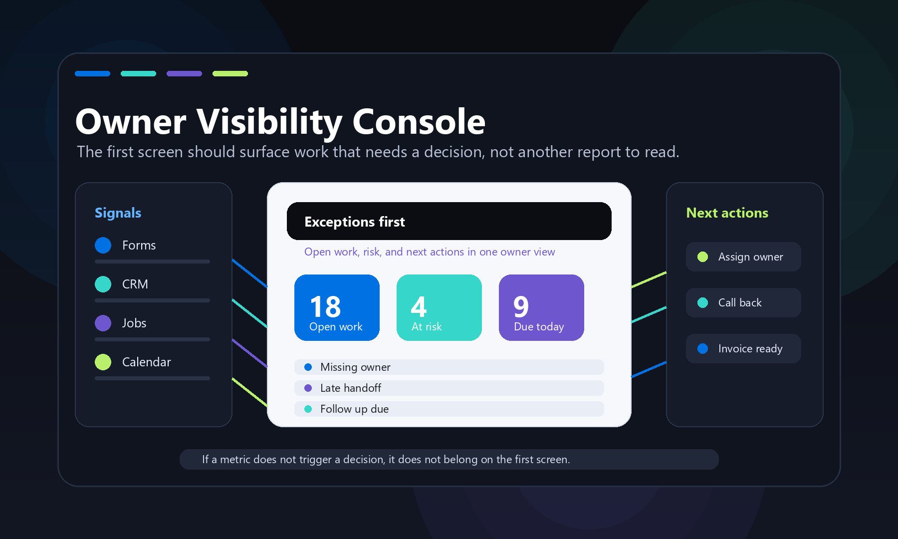
An operations dashboard for small business should answer one practical question: what needs attention today, and who owns the next move? It should not be a pretty wall of charts that the owner checks once a month. For Quad Cities shops, service businesses, manufacturers, nonprofits, and professional teams, the best dashboard is closer to a working control panel. It brings live work, exceptions, capacity, follow-up, and cash signals into one place so decisions stop hiding inside email threads, spreadsheets, calendars, and half-updated software.
That matters because many small businesses already have plenty of data. The problem is that the data is scattered. One system knows the quote status. Another knows the schedule. A spreadsheet tracks open work. A calendar shows who is available. A CRM has the customer history. The owner still has to ask three people what is really going on. A useful dashboard reduces that translation work.
What belongs in an operations dashboard for small business?
An operations dashboard for small business should include only the metrics that change daily decisions: active work, exceptions, owner bottlenecks, follow-up risk, capacity, and money tied to unfinished work. If a number does not trigger a decision, assignment, question, or follow-up, it probably does not belong on the first screen.
That is the main difference between a dashboard and a report. A report explains what happened. A dashboard helps decide what to do next. A good report might show monthly revenue, close rate, average ticket value, or year-over-year trend. A good operations dashboard shows what is late, what is stuck, what changed today, what needs approval, and what work is about to miss the customer promise.
For a small business, the first screen should usually answer these questions:
- What work is open right now?
- Which jobs, requests, quotes, tickets, or orders are at risk?
- Where is the next handoff waiting?
- What needs owner approval?
- Which customers need follow-up?
- What is scheduled, unscheduled, or over capacity?
- What cash, invoice, or quote value is tied to unfinished work?
This is why QC Devworks usually frames dashboard work as part of internal tools and workflow systems, not just analytics. The dashboard is the visible layer. The useful part is the system underneath it.
Start with the work, not the chart type
The strongest dashboard starts by mapping how work actually moves through the business. Chart choices come later. Before deciding between a bar chart, table, scorecard, or timeline, define the workflow states that matter.
For a service business, that might be new request, needs estimate, waiting on customer, scheduled, in progress, completed, invoiced, and follow-up needed. For a small manufacturer, the states might be RFQ received, estimating, customer clarification, quoted, accepted, waiting on material, in production, inspection, shipped, and invoiced. For a professional services team, the states might be lead, discovery, proposal, active project, waiting on client, ready for review, sent, paid, and renewal.
Once those states are clear, the dashboard can show the operational shape of the business. It can show the count and value of work in each state. It can show how long items have been waiting. It can flag items that skipped a required step. It can surface the difference between normal backlog and dangerous backlog.
Without that workflow map, dashboards drift into generic metrics. Revenue, traffic, leads, and completed jobs might be useful, but they rarely tell an operator what to do at 9:15 on a Tuesday.
The first screen should show exceptions
The first screen should make exceptions obvious before it shows general performance. Owners do not need another place to admire normal work. They need to see what is late, missing, blocked, duplicated, over budget, unassigned, or waiting too long.
Useful exception blocks might include:
- Requests with no assigned owner.
- Quotes older than a set threshold.
- Jobs scheduled without required materials.
- Completed work that has not been invoiced.
- Customers who received a quote but no follow-up.
- Calendar conflicts tied to active jobs.
- Open tickets from high-value accounts.
- Approvals waiting on the owner.
These are not vanity metrics. They are operational tripwires. If the dashboard shows four quotes older than seven days, somebody can call them. If completed work is missing invoices, somebody can fix it. If jobs are scheduled without parts, somebody can reorder the work before the customer notices.
This is also where custom software beats many off-the-shelf dashboards. A generic dashboard can show a count. A business-specific dashboard can understand what counts as late, risky, billable, urgent, or owner-blocked in that exact workflow.
Use metrics that create decisions
Each metric should have a decision attached to it. If nobody can name the decision, the metric is probably decoration.
| Dashboard signal | Decision it should trigger | Possible owner |
|---|---|---|
| New requests without assignment | Assign a person or reject bad-fit work | Operations lead |
| Quotes waiting more than five business days | Follow up, revise, or close the opportunity | Sales or owner |
| Jobs due this week without materials | Reschedule, order, or notify the customer | Scheduler |
| Completed jobs not invoiced | Create invoices and verify job closeout | Admin or finance |
| Recurring manual edits | Fix the form, integration, or approval rule | Systems owner |
The last row is important. A dashboard should not only report symptoms. It should expose where the system itself needs improvement. If the same handoff fails every week, the answer may not be another meeting. It may be a better form, a required field, a CRM rule, a scheduling integration, or a focused piece of custom software development.
Do not build a dashboard from dirty data and hope it becomes clean
A dashboard will expose messy operations, but it will not magically clean them. If your source systems use inconsistent names, missing statuses, duplicate records, unowned tasks, and free-text notes for critical steps, the dashboard will inherit those problems.
Before building the dashboard, define the minimum data rules:
- Which system is the source of truth for customers?
- Which system owns job, quote, or ticket status?
- What fields are required before work can move forward?
- Who can change each status?
- Which date matters: request date, promised date, scheduled date, completion date, or invoice date?
- How should duplicates be handled?
This is the part many dashboard articles skip. The visual layer is easy compared with the business rules. Tools like Looker Studio support many data connectors, and Microsoft documents several refresh modes and dependency issues for Power BI, including scheduled refresh and source schema changes. Those platform features are useful, but they do not decide what your business means by done, late, approved, scheduled, or ready to bill. That logic has to come from the workflow.
References: Google Looker Studio data source documentation and Microsoft Power BI data refresh documentation.
Manual process vs. a better system
The manual version of an operations dashboard is usually a spreadsheet, a weekly meeting, and a lot of private memory. Someone exports a report. Someone checks the calendar. Someone asks whether the quote went out. Someone updates a shared file. By the time the owner sees the summary, the reality has already changed.
A better system does not always mean a huge software project. It can start with a simple intake form, structured statuses, a few integrations, and a dashboard that reads from the right source systems. The key is that the dashboard should be connected to the work, not manually recreated beside the work.
For example, a better system might work like this:
- A form captures the request with required fields.
- The request creates or updates a customer record.
- The system assigns a status and owner.
- Calendar, quote, and follow-up events stay tied to the record.
- The dashboard shows exceptions and next actions automatically.
- Owners review the dashboard for decisions, not data entry.
That is the pivot from reporting to operations. The business is no longer asking, “who has the latest copy of the report?” It is asking, “what should we do next?” The dashboard becomes useful because the process behind it is useful.
When off-the-shelf tools are enough
Off-the-shelf dashboard tools are enough when the workflow is simple, the source systems already agree, and the team only needs a shared view. If the main goal is to view sales by month, website traffic, ad spend, or a handful of finance KPIs, a standard dashboard platform can be a good fit.
Use an off-the-shelf tool when:
- The data already lives in clean source systems.
- The dashboard does not need to change workflow status.
- Users only need read-only visibility.
- The same metrics apply to many businesses in the same way.
- The team can live with the tool’s built-in permissions and refresh rules.
Use an owned workflow system when the dashboard needs to understand your actual process. That includes custom statuses, quote rules, service territories, production stages, customer commitments, approval queues, role-based visibility, and integration with the tools your team already uses. This is where application engineering matters. The dashboard is only one screen inside a working system.
What a practical build should include
A practical operations dashboard build should include the dashboard, the rules behind it, and the maintenance plan that keeps it trusted. The goal is not to impress people with a complicated interface. The goal is to make the next decision easier.
A focused build should cover:
- Workflow map: the states work moves through, with clear definitions.
- Source-of-truth decisions: which system owns each critical field.
- Exception logic: what counts as late, blocked, unassigned, duplicate, or ready.
- Role views: what owners, managers, admins, and frontline staff need to see.
- Refresh plan: how often the data updates and what happens when a source fails.
- Action paths: where users go to assign work, follow up, approve, invoice, or correct data.
- Auditability: who changed important statuses and when.
That last item matters in small teams. When work gets busy, everyone remembers the handoff differently. A simple audit trail can prevent confusion without turning the business into a bureaucracy.
A local dashboard should reflect local work
A Quad Cities operations dashboard should reflect the business that actually uses it. A manufacturer in Moline, a contractor in Bettendorf, a clinic-adjacent professional service in Davenport, and a nonprofit in Rock Island do not need the same first screen. They may all need visibility, but they do not share the same bottlenecks.
For a manufacturer, the key view may be RFQs, material readiness, production status, and shipped-not-invoiced work. For a field service company, it may be inbound requests, schedule capacity, open estimates, no-shows, and callbacks. For a professional services firm, it may be pipeline, active projects, waiting-on-client items, review queues, and billing readiness.
The local angle is not about adding “Quad Cities” to a heading. It is about understanding how local operators actually make decisions with limited time, small teams, and tools that were never designed to work together.
How to know you are ready
You are ready for an operations dashboard when the same questions keep interrupting work. If the owner, office manager, scheduler, or team lead repeatedly has to ask for status, chase missing information, reconcile spreadsheets, or rebuild the same weekly report, the business probably needs a better visibility layer.
Good signs include:
- The team cannot quickly answer what is open, late, or blocked.
- Important follow-up depends on one person’s memory.
- Multiple systems hold partial truth.
- Meetings are used to reconstruct basic status.
- Work gets delayed because approvals are invisible.
- Invoices, quotes, or handoffs fall behind after busy weeks.
If those symptoms are present, start with a short operational systems audit before buying another dashboard license. QC Devworks can help map the workflow, identify the source-of-truth problems, and decide whether the answer is a simple dashboard, a focused integration, or a small owned tool. The next step is the same either way: make the work visible enough that the business can act on it. The free operations audit is the cleanest place to start.